Media Mirch
A PR agency that creates headlines, on a site that reads like a front page.
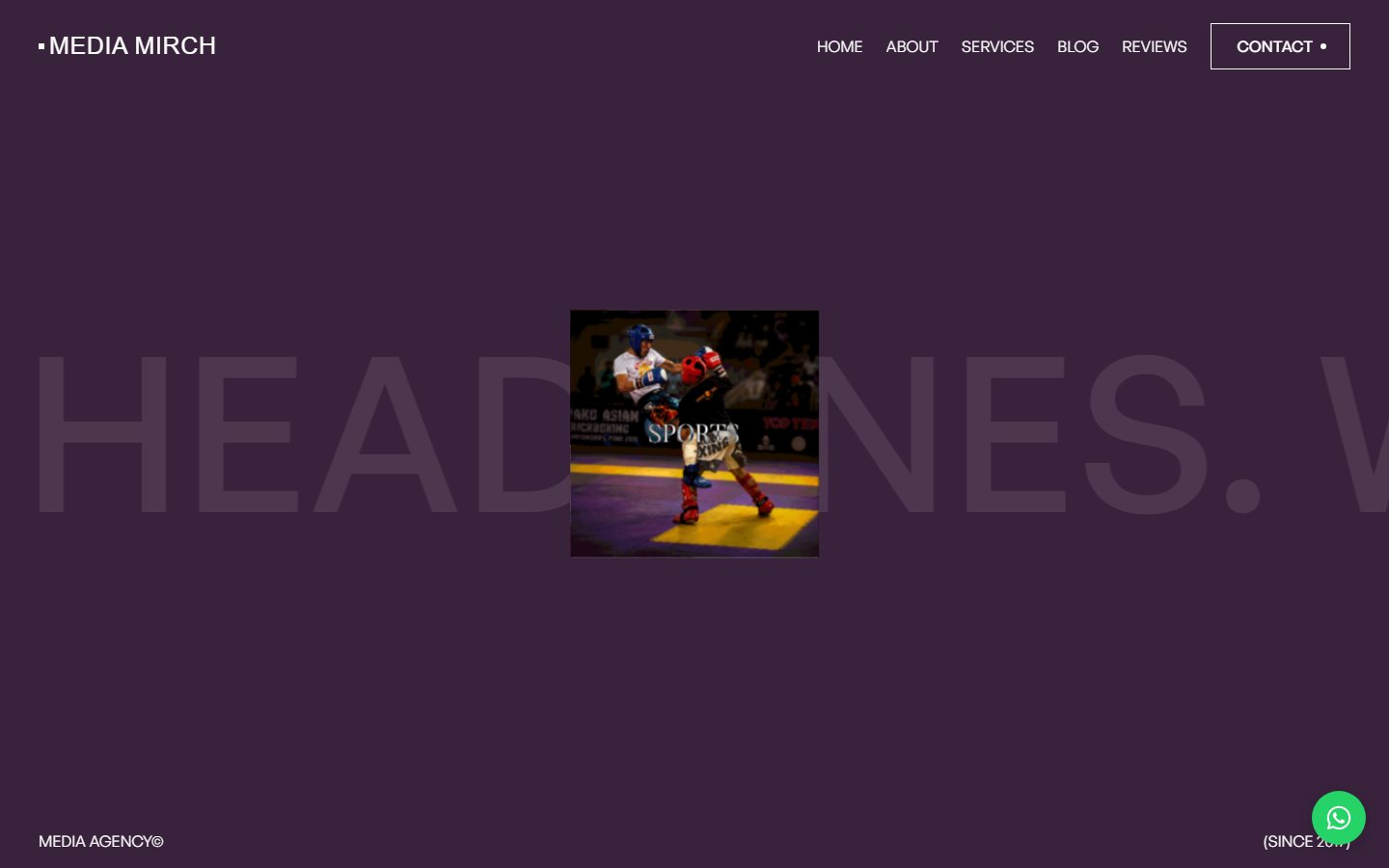
The idea
Media Mirch has run PR, corporate communications and event coverage since 2017. The site lets the photography lead, with one word over each story and a FAQ written to be quoted.
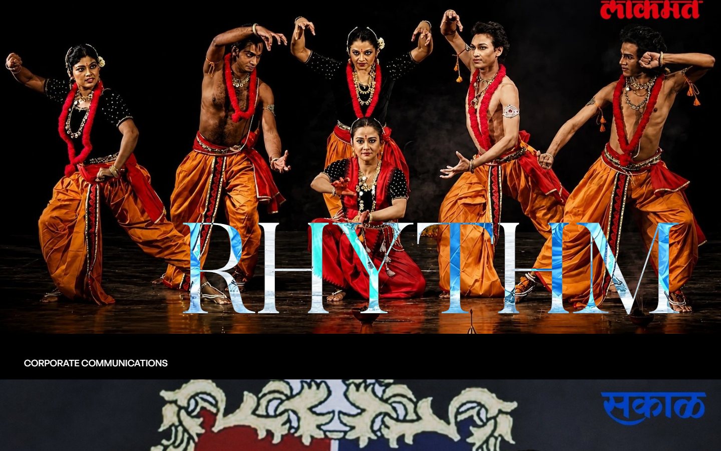
“Rhythm”: corporate communications, shown full-bleed with a single word.
Moment.
Press events, caught as they happen.
Rhythm.
Performance and culture, full-bleed.
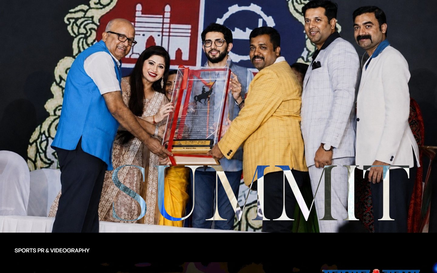
Summit.
Awards and ceremonies, one word each.
Process
From brief to handoff
DiscoverDefineDesignDeliver
Research
Structure
Wireframes
Visual design
Design system
Build
Handoff
Phases in sequence, not to scale.
Problem solving
Three problems, three answers
A PR agency's own site is read by editors, brands and search engines at once.
The best material is photography, easily buried under generic cards.
A stock agency template pleases none of the three audiences.
Media Mirch
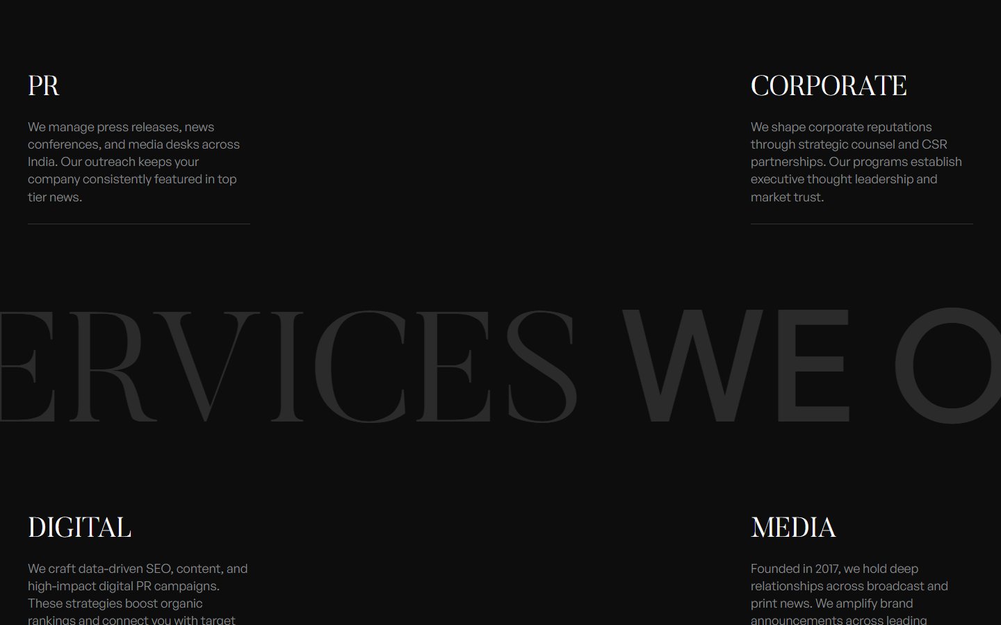
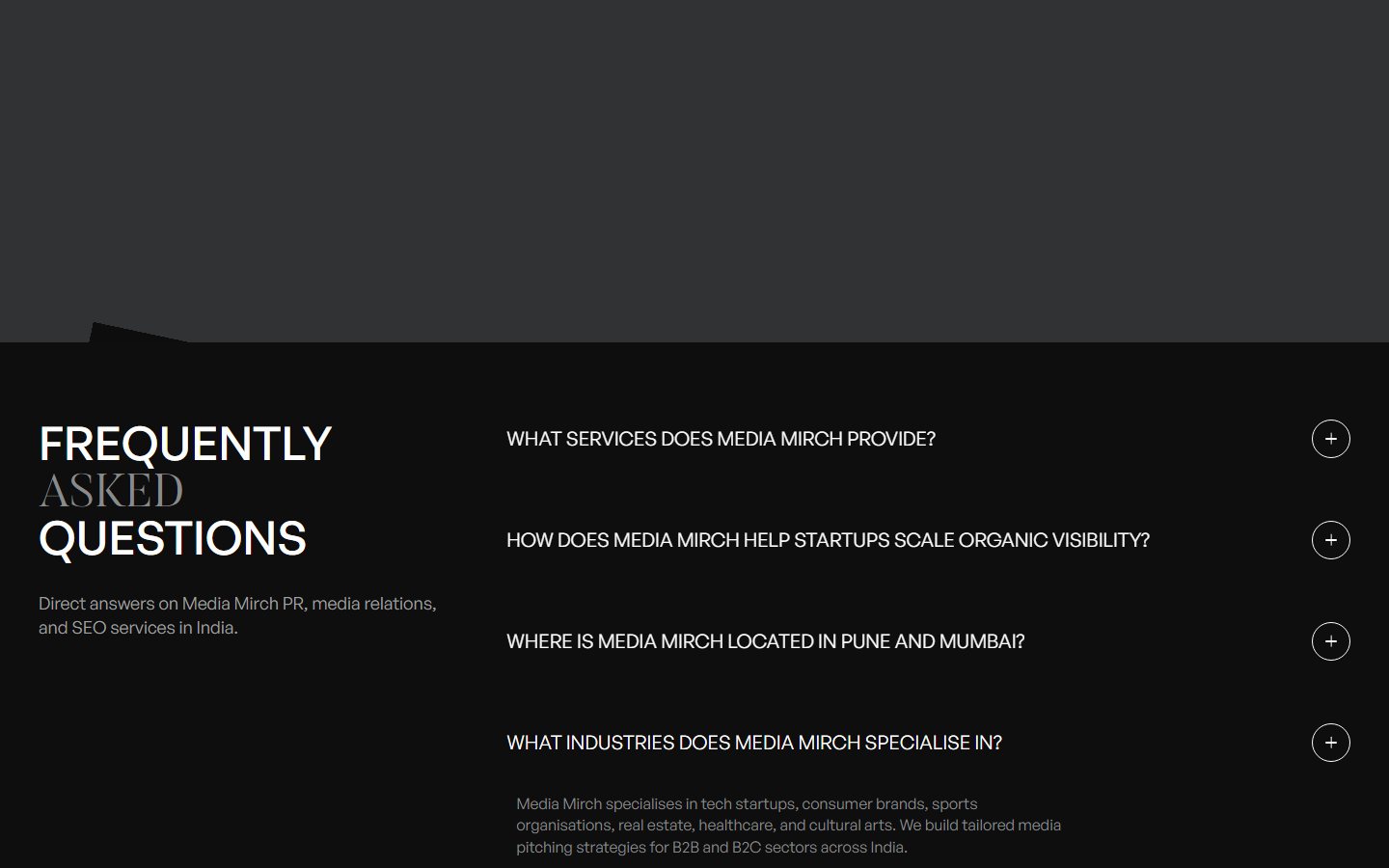
Plain-language services and a question-led FAQ that can be quoted.
Full-bleed images, one per section, with one serif word.
Editorial type on a dark ground, and nothing decorative.
Who it is for
The brand manager choosing a PR agency
B
The brand manager
Archetype from the brief. Not a real customer.
Jobs to be done
- Judge the agency's taste in a minute.
- See real events and real coverage.
- Find answers on timelines and scope.
- Reach the right person quickly.
What gets in the way
- Agency sites that all look alike.
- Claims without examples.
- Long forms before any answer.
- Unclear services.
Brand and design system
The system, taken from the product
Media Mirch
Aa
Butler 300 for display words · General Sans 400 and 600 for text
ABCDEFGHIJKLM
abcdefghijklm 0123456789
abcdefghijklm 0123456789
Black#0D0D0DGround
White#FDFDFDText
Grey#888A8CSecondary text
Dark grey#313233Rules, panels
Scene olive#AEA55EHero scene
Scene plum#4A2B50Hero scene
ButtonsGet startedContact
Tags and fieldsCase study
Your email
Card
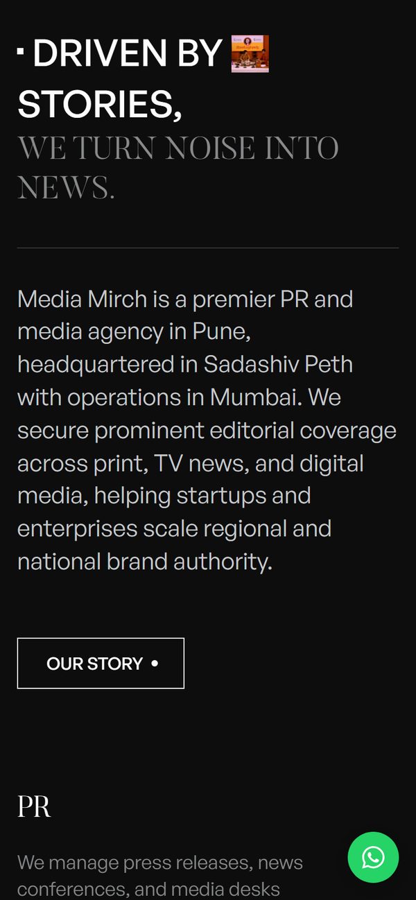
Driven by storiesWe turn noise into news.
StateView01 of 04
Design rules
Few rules, held everywhere
2
Typefaces: a light serif for words, a grotesque for text.
1 word
One oversized word per story, over the photograph.
0px
Square corners, hairline rules, no shadows.
Dark
A near-black ground, with scene colours that change as you scroll.
User flow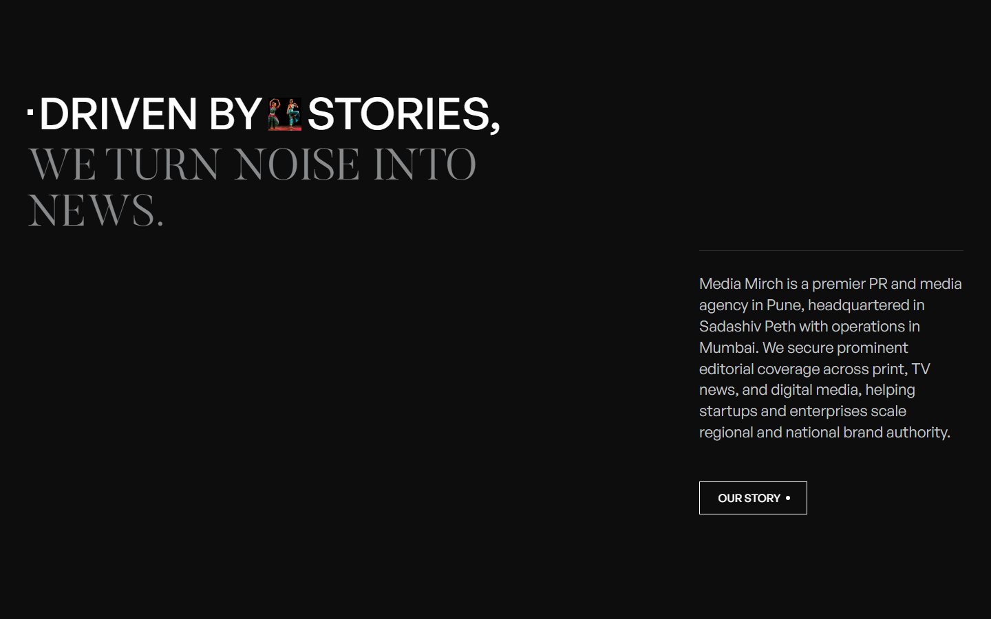
One path to a conversation
1. Home
2. Story
3. Services
4. Work
5. FAQ
Photography
One word per story.
Moment, rhythm, summit, capture. The word does the work of a headline.
On every screen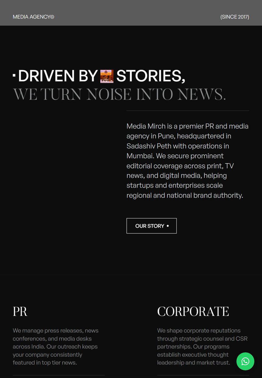
The same front page, at every size
Search
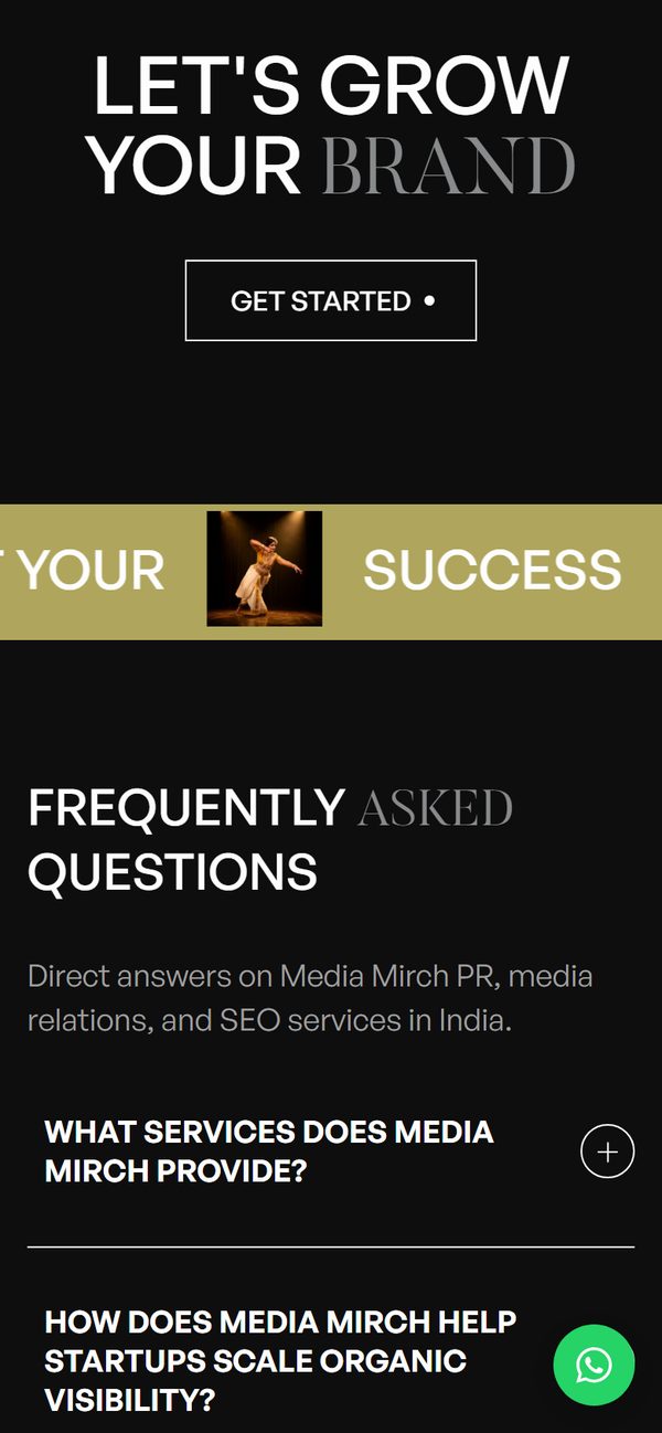
Written to be quoted.
Questions people actually ask an agency, answered in plain language.
In your hand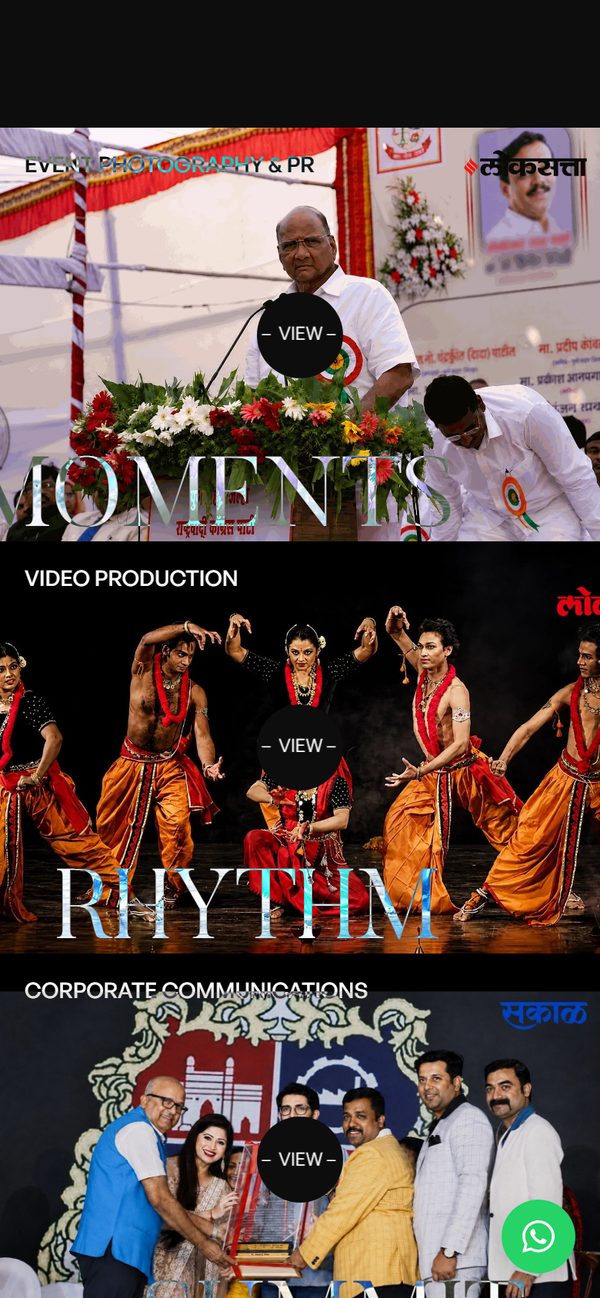
Four moments on a phone
Thank you